It seems that when I approach an object with the aim of decorating it, I tend to feel a bit paralyzed. I do have my trusty stash of idea generators to help with getting a start, but still, I often have that feeling of , "what if I decorate all these things with mediocre designs, and then I figure out something really good and I have nothing left to put it onto."
so, I decided to spend a bit of time with paper and watercolor to try out a few patterns to try to get over this.
First, I got out the stack of test tiles with the colors of the underglazes that I have, (with the exception of the red, I still need to do a tile for it. also, should I get a light purple?)
I took photos of each pair outside, but the photos aren't too good, as there were a lot of shadows from the trees.
However, I did notice that the tiles with the black wash, where they are unglazed, do have a bit of a sheen that is lacking in the plain "non-washed " counterpart. Presumably it must be that little bit of gerstley borate that it is mixed with. (This bodes well for the birds)
Then, I put out watercolors on a palette that corresponded to the colors that I have in underglaze.
Most of these have a tinted element to them.
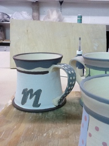
I started by drawing a simple outline of the mug shape that I've been mainly using. Then, decided to simplify by using a rectangle divided into the basic zones of the cup.
rim,
top band,
dividing band,
main area,
bottom rounded edge
Of course, the main area gives the most opportunity for pattern, but I think it is important for all the areas to balance out.
As I painted, I tried to keep in mind how this would actually play out on a 3-d object, and how the brush would behave with underglaze as opposed to watercolor.
Sometimes I go over the underglaze more than once to make sure that it isn't too streaky. This is particularly prone to happen with the pink.
I jotted down some questions as I went along. For instance on this one, if the grid behind the small dots is made in pencil, will it impress on the clay enough to trap the black wash enough to make a light outline of the grid?
In the center sample below, I used pencil cross-hatching to simulate scratching texture into the clay with a jagged metal rib, again to hopefully catch the wash of black
I'll need to see how much of the black wash is enough, or too much, or not enough for the effect that I'm looking for.
I like to use white slip in the slip trailer to make dots and lines, and tried to simulate that with thick paint. I outlined it with pencil in some of the sketches, hoping to approach the effect that the black wash has on it.
If the bands of underglaze overlap, will that provide enough of a line to capture the black wash as an outline?
 |
| the background on these two on the left is an ombre effect, I need to see if that can be done with the UG's, |
The test tile with the white underglaze picked up the wash in a particularly effective way. Unglazed, it looked almost like birch bark. Under the clear glaze the effect was a bit more diffused, or blurred. However, the unglazed effect might be nice on scuptural things, but not on functional ware,
Also at some point, I realized that I had enough room on my page to do an extended upper band painting.
 |
| These ones sort of remind me of beach umbrellas, or awnings. I tried to add a slip trailed diagonal line over the strip on the left design |
I think that it is good to try these patterns out a bit like this,.. It was very similar to painting the actual ware, in that the background is painted, then set aside to dry before additional pattern is added. So, sometimes i might have an idea when I put the base coat on, but can't remember what it was when I come back to it later on to add the pattern.
 |
| I think this idea is sort of fun, |
I know that over time I'll evolve into a set of more easily recalled patterns and combinations, but for now, it is good to try to come up with some new ideas.
At the end of this exercise I have 2 main avenues to pursue:
1. explore more the ways that black can be used as an outline:
through impressing the clay when damp to catch the wash later
mishima when leather hard, areas filled in later with color
outlining with brush-strokes of underglaze
adding black on the rim or base edge with wash over the raw glaze
(the underglaze pencil-- I like the effect of it, but don't like the process of using it on bisque)
2. thinking more about forms with which this type of pattern would be compatible. Right now I think that clean, flat areas might show off this type of decoration well, but are those the kind of forms that I am wanting to pursue? How do these patterns lend them selves to more rounded forms? and what about texture on the pots such as throwing rings-- how would that affect the patterns?
3. And don't forget that it is fun to carve designs into leather hard clay as well as painting stuff.
Tomorrow I hope to go to the studio again, and a glaze load should be ready to unload! Yay! It has in some mugs using the Loafer's Glory clay, which is great, because I don't like the Moon White clay body at all. It doesn't seem to vitrify and all the foot rings and bottoms are going weirdly grey.... :(